Theatre Helpline
Branding / logo design / digital design / print design / animation / UX / UI / website design / collateral design / editorial design
Theatre Helpline is a free, independent service available for anyone working in the theatre industry to receive support and signposting for anything which is affecting their wellbeing.
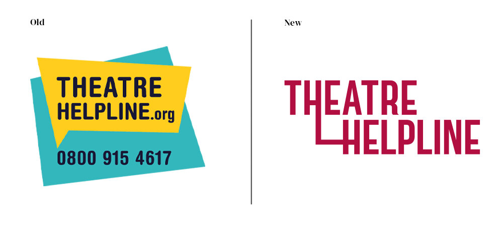
I was asked to redesign the Helpline’s visual brand. The new brand had to convey that Theatre Helpline is available for everyone and assists with any problem. It needed to be bold and theatrical, without straying into glibness or childishness.
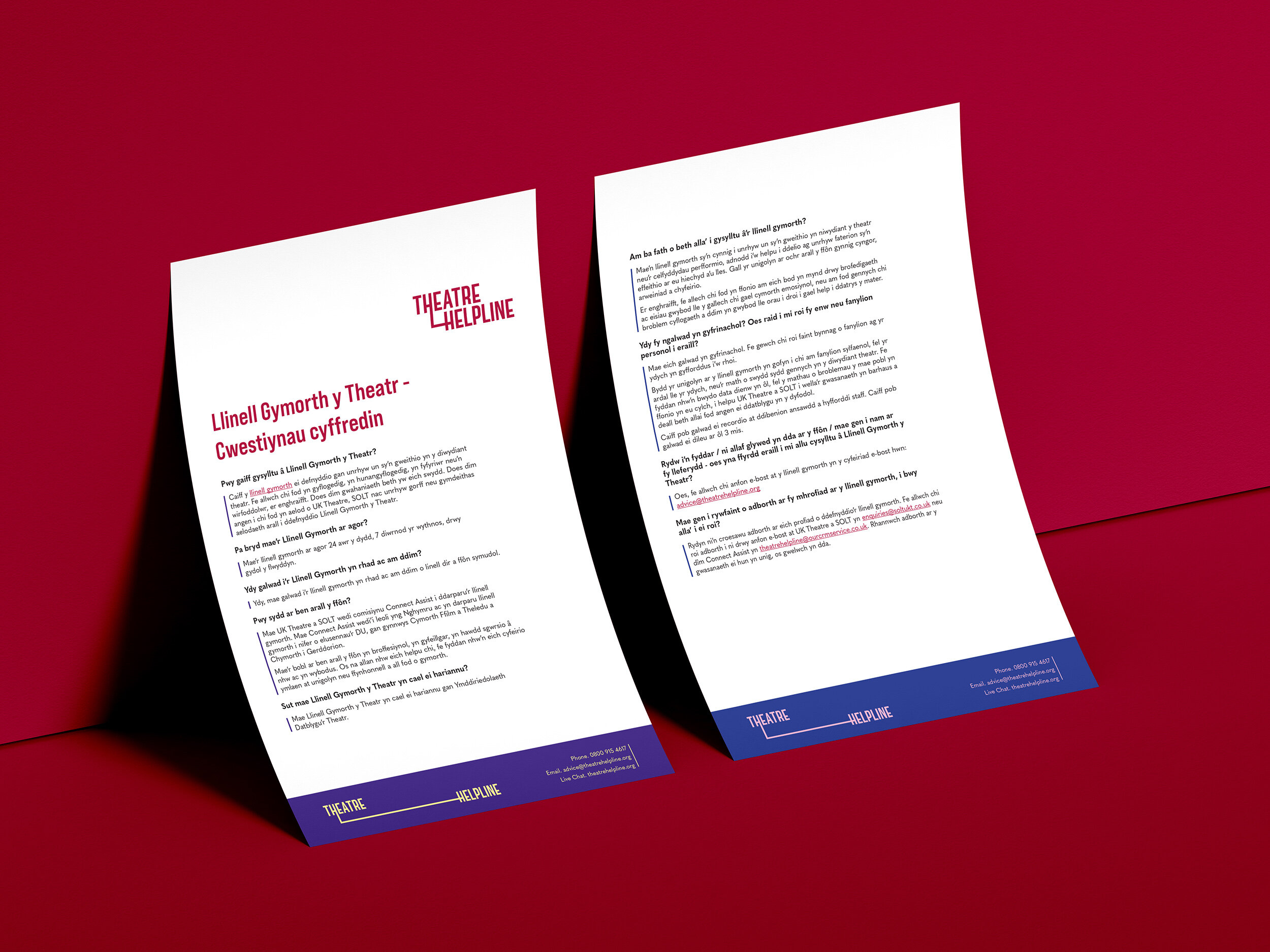
I designed a new logo and brand guidelines for the Helpline, along with the user interface for a new website and various animated and static adverts. I looked at the website UX and designed a restructure as well as visual overhaul, aiming to make the services easier to understand for users who are going through a difficult time and want simplicity.

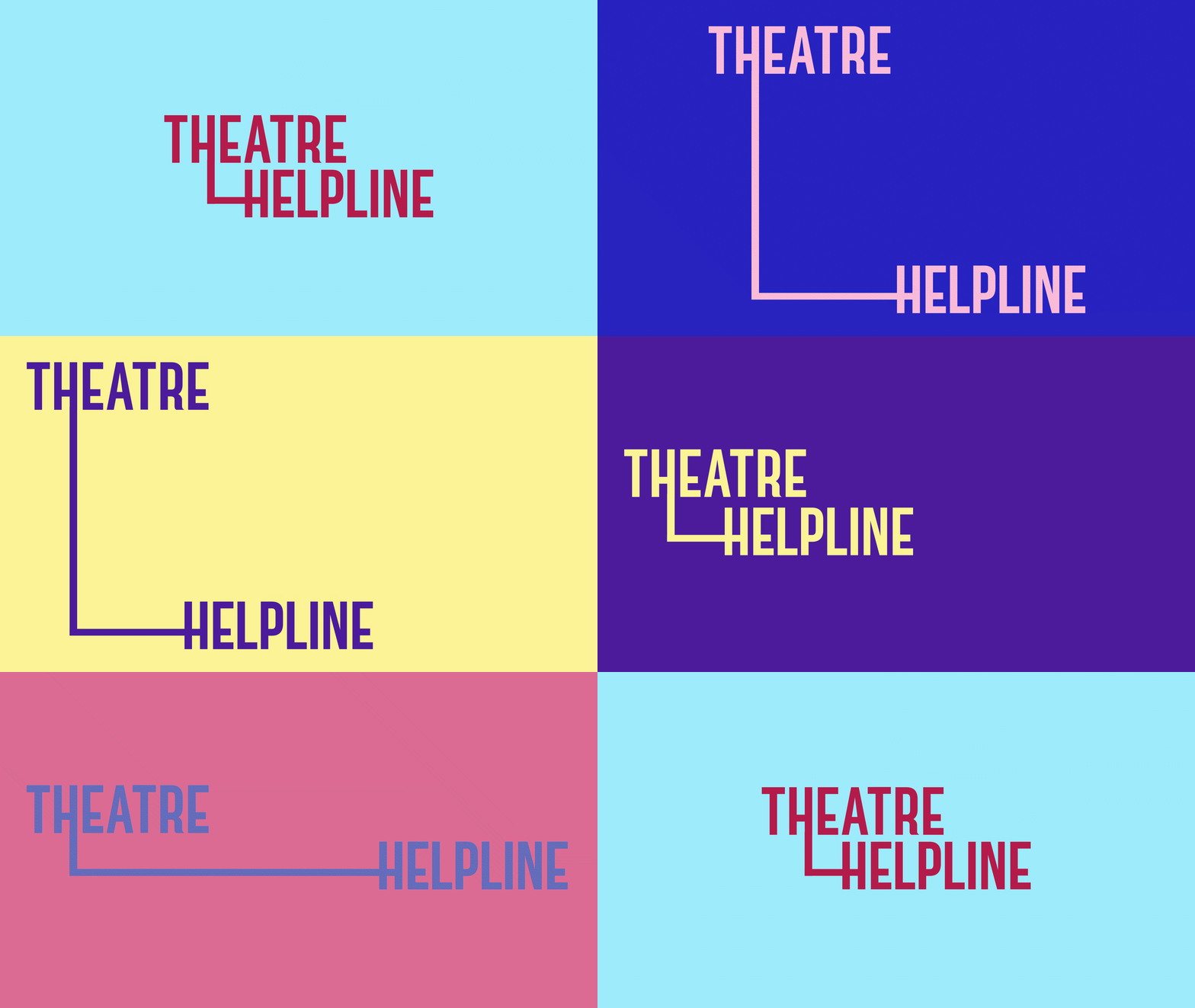
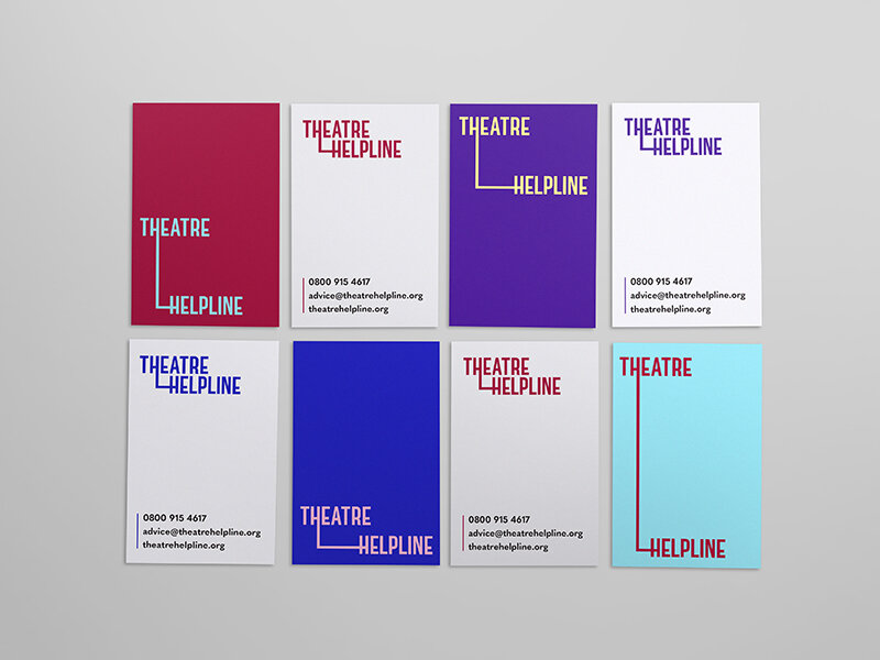
The Theatre Helpline logo can change shapes and colours as needed. I wanted the logo and the brand to have a certain flexibility and dynamicism which reflects the theatre industry and the fact that the helpline provides different kinds of support tailored to different problems, for anyone who needs the help.

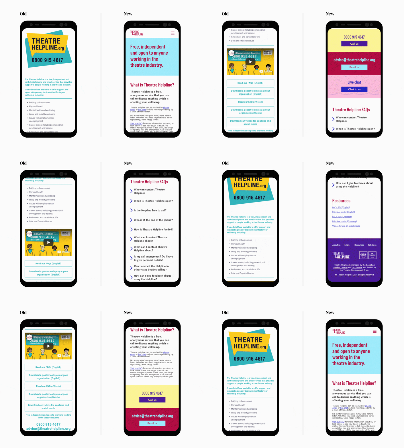
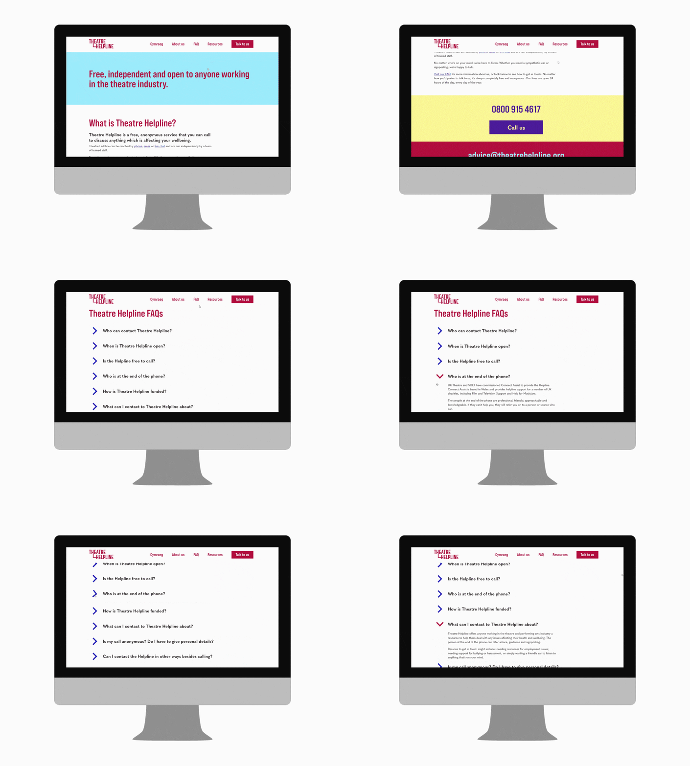
When looking at the website, I started by speaking to users and writing down key reasons to visit the website and how to make these easier. I felt that the information hierarchy could be clearer, with the contact details being a critical part of why someone would visit the website.
I was also aware that users are often unsure if the Helpline is for their issue, so I kept the ‘about’ section of the website at the top. I then moved on to the contact details in bright colours that could easily be seen by someone scrolling. I recommended the FAQs be built into the page rather than as downloadable documents, as my discussions showed this would be clearer for someone who is stressed and uncertain needing to navigate the site.
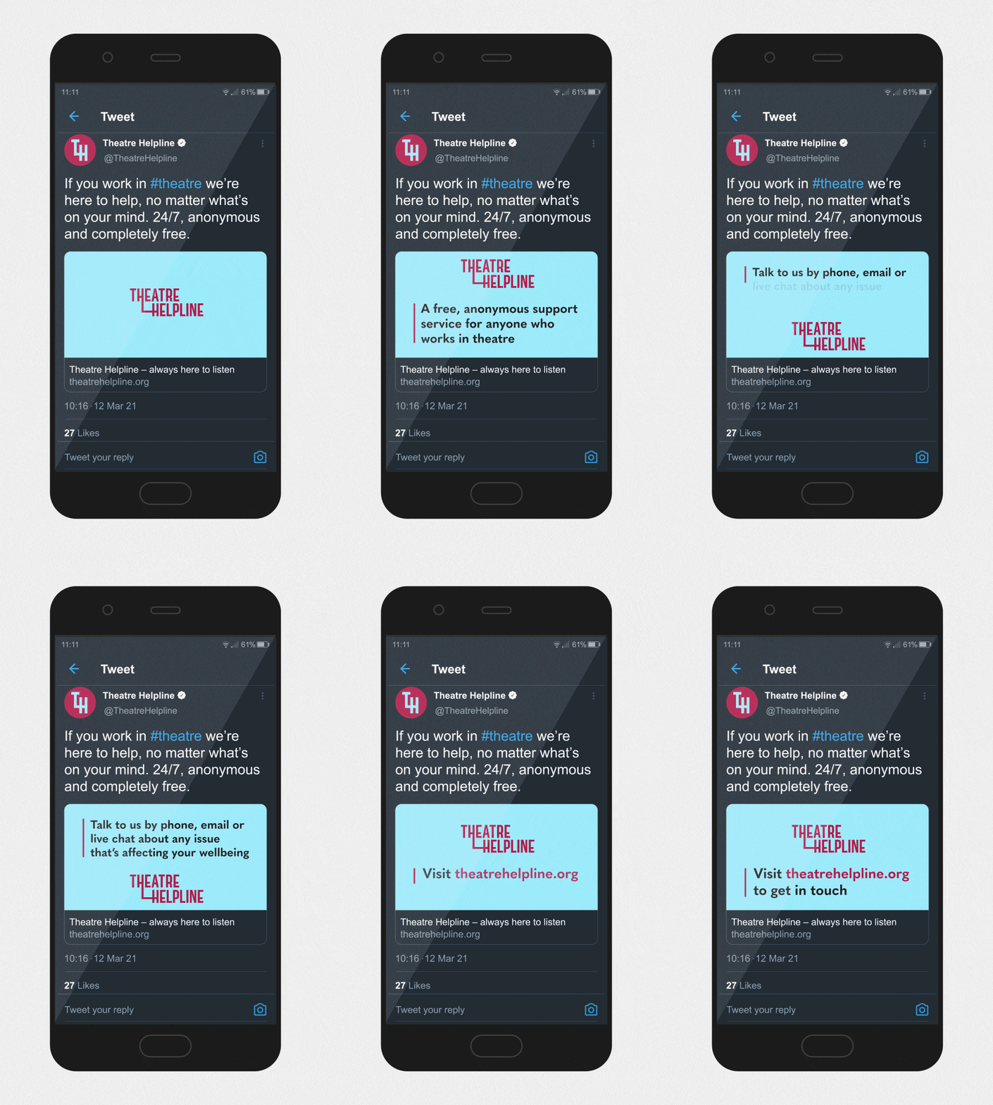
Although the colour changing is a key part of the brand, I decided to stick with one pairing at a time for information-based advertising. I wanted the focus to be on the information and how to access the Helpline, and I felt that changing colours - while eye-catching - would be too distracting.
Although different ads can use different pairings, the distinct movement of the logo links them together as a single brand.
