Theatre for Every Child
Branding / logo design / email design / digital design / print design / collateral design
Theatre for Every Child is a campaign spearheaded by the Society of London Theatre and UK Theatre. Their aim is simple: every child should visit the theatre before they leave school.
The brand is primarily visible to stakeholders in government, education and theatre. The brief asked for something clear in its messaging, theatrical in nature but also serious, and also distinct from SOLT and UK Theatre’s existing brands.

The logo draws from the classic comedy and tragedy masks which are heavily associated with theatre. Here, the form is applied to the text in an abstract way, conveying association with the performing arts without being too overt.
I considered many primary colours for this brand. Teal was ultimately the unanimous choice due to its neutrality from SOLT & UK Theatre as well as its playful but business-friendly air which suited a campaign like this.

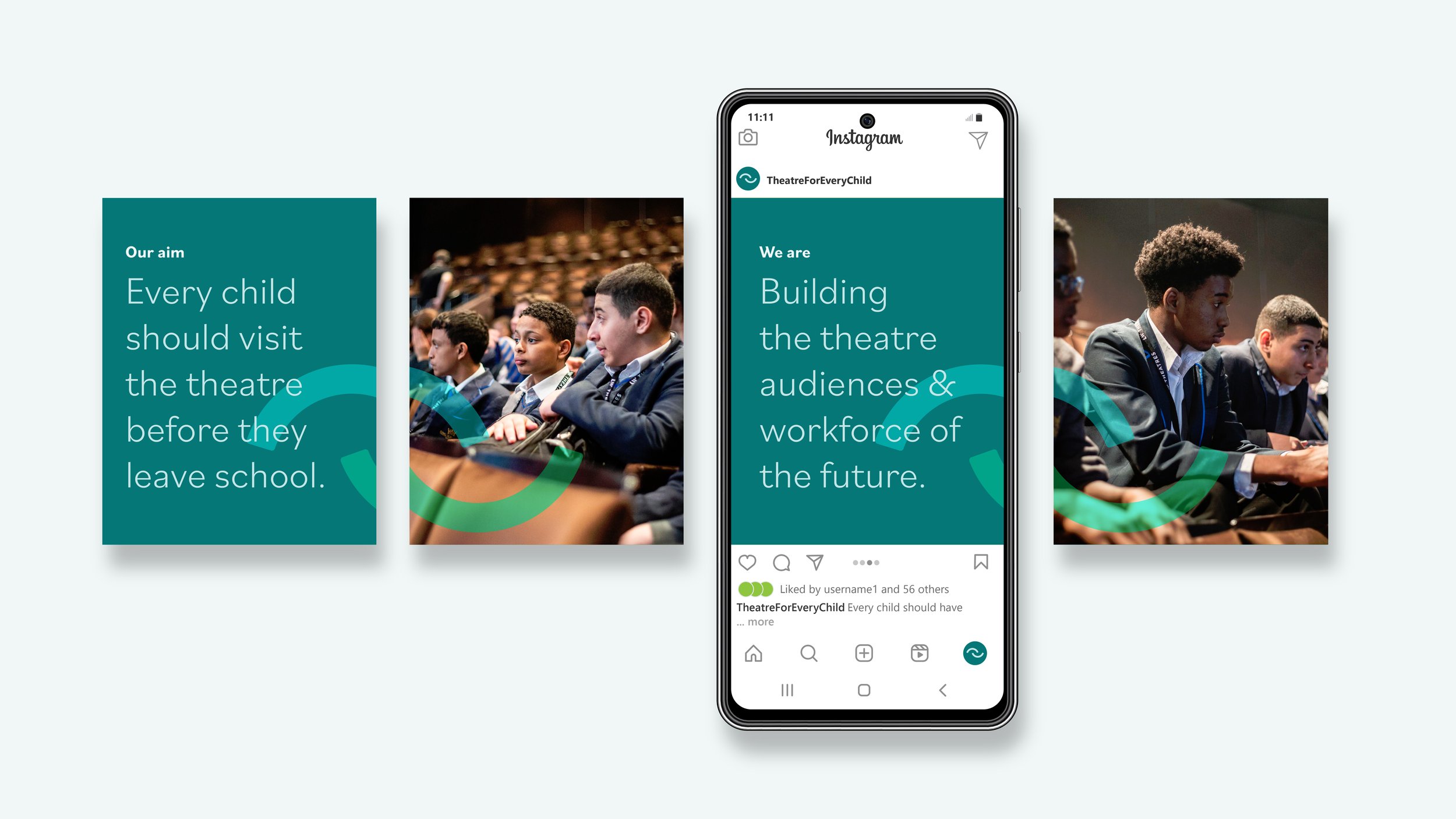
The logo icon can be used where the logotype would be unreadable at small sizes, but also as a graphical device to make a strong brand identity. Using SOLT’s existing photographic assets, the icon links the text and images, creating a carousel which is both visually striking and cohesive with each separate part. Using the icon like this also emphasises the comedy/tragedy connection to better associate the material with theatre.

This style of typography and imagery works equally well across print and digital applications, which is crucial for a brand which relies on both. It’s simplicity and clarity is also very appealing for less technical internal and external stakeholders, who can feel empowered to create their own assets and really get involved with the campaign.


I created the brand guidelines for Theatre for Every Child. As it is such a depature from SOLT & UK Theatre’s usual visuals, these are crucial for ensuring that all team members are on board and can make consistent materials. They can also be passed on to external web designers and stakeholders who want to participate in the campaign. With this audience in mind, the guidelines also cover best practice such as accessible design to ensure that all content will embody the values of the campaign.
As well as this, they serve as an example of best practice when working with the brand, with examples of typography, imagery and graphics for readers to draw on for inspiration.


