


Branding / logo design / typography / font design / packaging design / clothing design
Share A Slice is a Neapolitan pizzeria based in London. They are also a social enterprise: for every pizza purchased by a customer, they donate another pizza to those in need. The team places a high emphasis on their social work, pairing it with a desire to make truly great and authentic Neapolitan pizza that anyone can enjoy.
I’ve worked with Share A Slice on numerous graphic design and illustration projects. Recently, I was asked to redesign their logo and refine the rest of their visual brand. The team have come a long way and significantly expanded their offering with two sites, deliveries, and make-it-yourself pizza kits. They felt it was time to refresh their brand and get something that could truly represent who they want Share A Slice to be in the London pizza market.
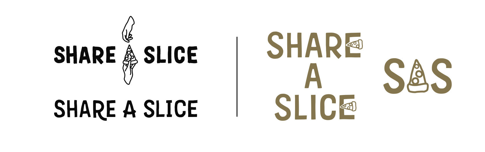
Old vs new logo comparison. The Share A Slice team loved the idea of incorporating line illustrations into the typography, which is reflected in the final logo.
The key challenge with this was ensuring that the E would not become difficult to read at small sizes. To mitigate this, the stacked and inline versions of the logo mean that Share A Slice can always maximise use of the space they have. The icon then features thicker lines on the pizza slice to remain readable at very small sizes.
Logo development drafts compared to final logo and icon. I refined the lettering considerably from its original appearance when it was first digitised. I wanted to keep the hand-drawn elements of the type, but also smooth them and give them a certain level of precision, much like a pizza.
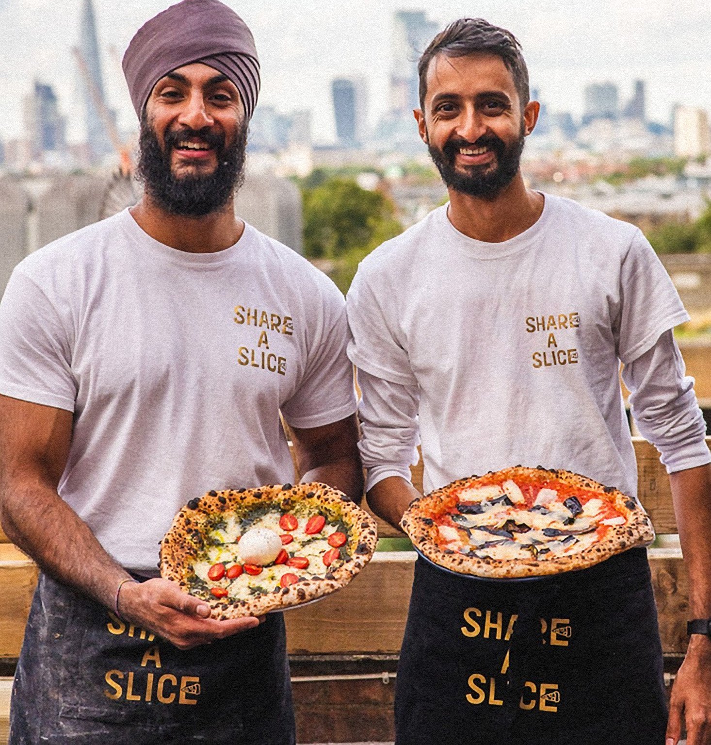
Photo credit: @ShareASlice